interface design
Timelines Re-visited
So it seems that Facebook is finally taking it’s Timelines feature out of Beta (now in full production mode) and pretty soon is going to be forcing those of us who haven’t bothered to changeover, to have one. Why have they devoted so much energy to this seemingly trivial feature… and what happened to those services that already existed for creating personal timelines? About 3 years ago I did do some research into the ‘Timeline’ services available on the internet with a view to developing a standalone service for a major broadcaster. So what insights does that give me?
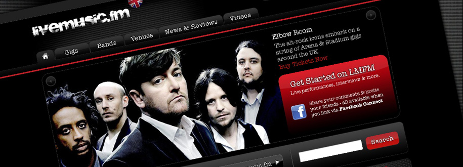
Livemusic.fm Revamp
The autumn of 2010 saw an enhancement and augmentation of the user based widgets – more Facebook integration, News Feeds, Personalised alerts etc – The Summer of 2011 saw the next release implemented. The user flows have been re-architected and generally there is a much stronger focus on selling tickets and thus wayfinding and promotional messaging to that effect.
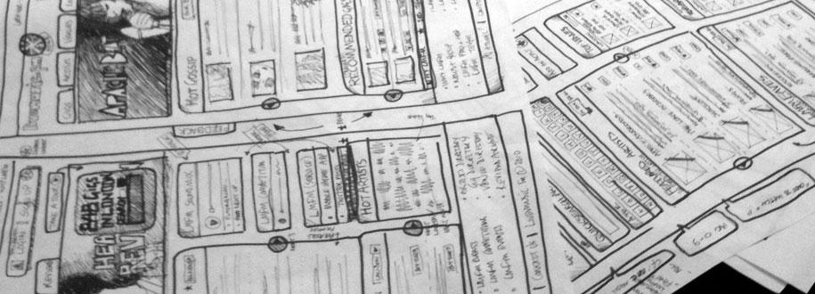
Old Skool is No Fool
Sometimes it’s really refreshing to go ‘undigital’ as it were, and really get back to basics. So, since we are looking at doing a major overhaul of the livemusic.fm IA and user interface, I thought it justified getting out the old A3 flip pad, some markers and a ton of mini Post It notes.
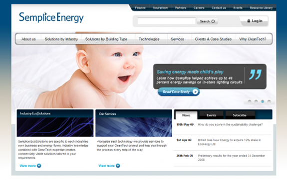
Cleantech solutions? Child’s play.
Launched in mid-May this was a recent project for Semplice, a Cleantech based consultancy now fully owned by Centrica (British Gas). As is becoming customary on projects that I art direct, there is a susbtsantial rich media component right up front that showcases Semplices Services and their part in the cleantech ‘revolution’ and allows users to “deep-link” to areas of interest throughout the site.
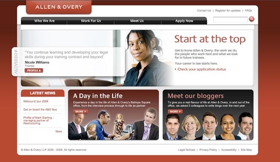
A&O Graduate wins its first award
Well hopefully this will be the first of many – we’ve entered it for a Webby (after getting an Honoree status in 2007) and will prolly enter it for a BIMA later this year. The TARGET graduate awards will also be a stepping stone (again the site as nominated in 2007 but lost out to Clifford Chance). Anyway so far so good – one Graduate award in the bag, The Lawyer HR awards:
Future Camden
A sneak preview of the ‘Future Camden’ work we are doing with Smokefree Camden … images courtesy of Mr Alan Benzie (with some interference and direction from myself!)
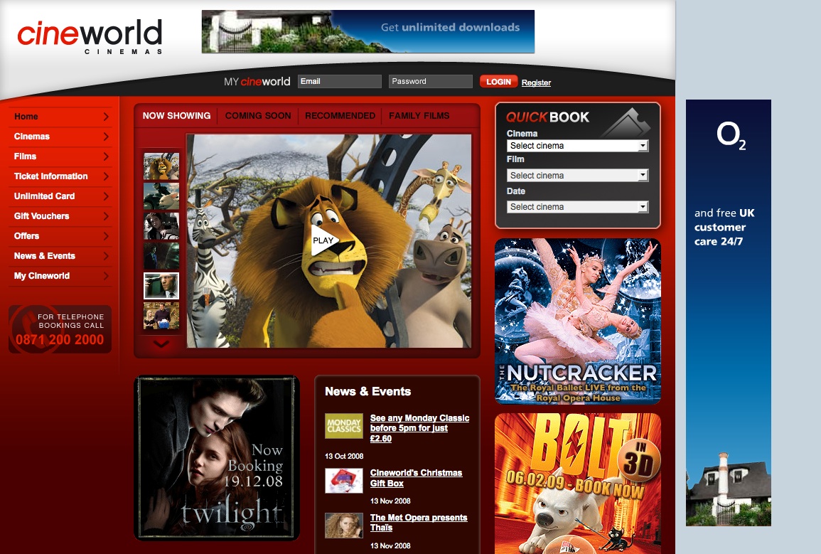
Cineworld
Well it’s been up and running for a week or so now and the feedback is pretty good. I have to confess I didn’t have an awful lot to do with this project and most of my involvement was the user flow and IA of the QuickBook system which works pretty well – though it seems that my recommendation of prefixing the London Cinemas with ‘London’ tag has been ignored!
Wayfinding & Signposting in interface design
“You have to lead them by the hand – It’s not the number of clicks, it’s the confidence level that you’re still headed in the right direction”
Steve Krug “Don’t make Me Think – A Common Sense Approach to Web Usability”
Best-practice involves making navigation and interaction as simple and logical as possible for the user. This is neatly summarized by the concept of ‘wayfinding’ – an alternative and more natural approach to what is normally captured under the heading of “Information Architecture”.
Recent Posts
Search
Categories
Archives
- January 2012
- December 2011
- November 2011
- October 2011
- September 2011
- June 2011
- May 2011
- February 2011
- December 2010
- November 2010
- September 2010
- June 2010
- May 2010
- April 2010
- January 2010
- December 2009
- November 2009
- October 2009
- September 2009
- May 2009
- April 2009
- February 2009
- January 2009
- December 2008
- November 2008
- October 2008
- September 2008
