interface design
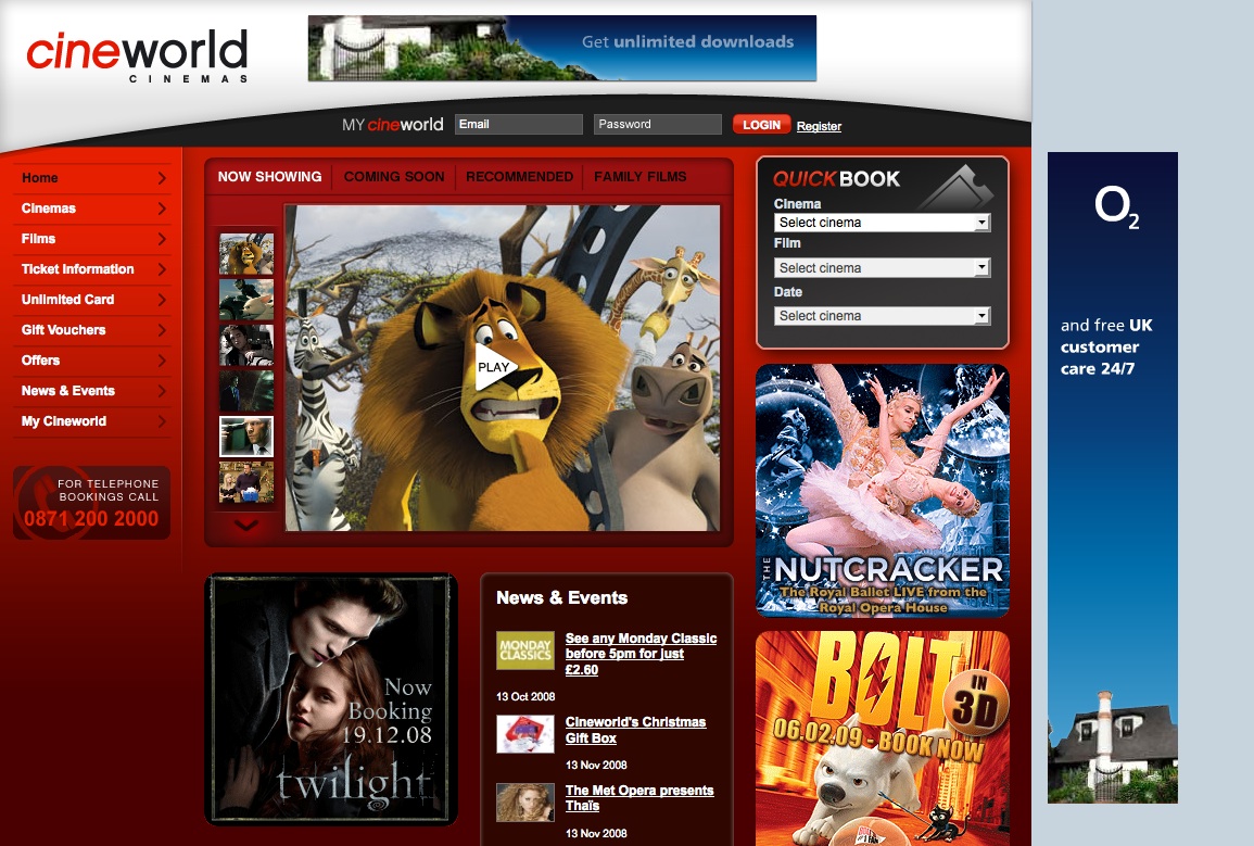
Cineworld
Well it’s been up and running for a week or so now and the feedback is pretty good. I have to confess I didn’t have an awful lot to do with this project and most of my involvement was the user flow and IA of the QuickBook system which works pretty well – though it seems that my recommendation of prefixing the London Cinemas with ‘London’ tag has been ignored!
Wayfinding & Signposting in interface design
“You have to lead them by the hand – It’s not the number of clicks, it’s the confidence level that you’re still headed in the right direction”
Steve Krug “Don’t make Me Think – A Common Sense Approach to Web Usability”
Best-practice involves making navigation and interaction as simple and logical as possible for the user. This is neatly summarized by the concept of ‘wayfinding’ – an alternative and more natural approach to what is normally captured under the heading of “Information Architecture”.
Recent Posts
Search
Categories
Archives
- January 2012
- December 2011
- November 2011
- October 2011
- September 2011
- June 2011
- May 2011
- February 2011
- December 2010
- November 2010
- September 2010
- June 2010
- May 2010
- April 2010
- January 2010
- December 2009
- November 2009
- October 2009
- September 2009
- May 2009
- April 2009
- February 2009
- January 2009
- December 2008
- November 2008
- October 2008
- September 2008

