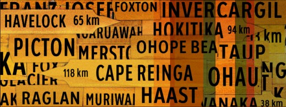
Wayfinding & Signposting in interface design
“You have to lead them by the hand – It’s not the number of clicks, it’s the confidence level that you’re still headed in the right direction”
Steve Krug “Don’t make Me Think – A Common Sense Approach to Web Usability”
Best-practice involves making navigation and interaction as simple and logical as possible for the user. This is neatly summarized by the concept of ‘wayfinding’ – an alternative and more natural approach to what is normally captured under the heading of “Information Architecture”.
The concept of “wayfinding” is about navigating complex and sometimes unfamiliar space. Just because a website has ample navigational links doesn’t mean that people will see them, understand them, or ultimately use them. Meaningful labelling and nomenclature is therefore all important.
Wayfinding is not just signage – you’ve got to make users want to go to particular place. Ultimately the role of “wayfinding” in digital design is about improving the browsing experience and thus provide the desired reward at the end of the user journey; whether that be information, a successful e-commerce transaction or watching an interactive feature online.
Some basic tips:
- Clear, meaningful language
- Making use of learnt behaviours and accepted visual metaphors (buttons, input fields, arrows etc)
- A reason to commit to the click the What’s in it for Me? factor. Users must have an identifiable reward – intrigue, gossip, comedy, financial gain, product gratification, general informational or whatever.
- Text is easy to read – contrasting colours, size is big enough (This is particularly important for the identified user demographics outside of the usual 18 -35 ABC1s)
- Eye-catching – create something visually stimulating!
- Groupings of content should therefore be logical and useful. Navigational metaphors should be clear and concise with meaningful wording.
Words and image by R M Lippiett © 2008
—
Note on the term Wayfinding
The term “wayfinding” was first used in 1960 by architect Kevin Lynch in The “Image of the City” where he referred to maps, street numbers, directional signs and other elements as “way-finding” devices.
—
Links
- Rosalie Gascoigne on Wikipedia
- Te Ara – New Zealand Online Encyclopaedia
- Te Ara – Places
- Wayfinding on Wikipedia
Fancy a share?
Recent Posts
Search
Categories
Archives
- January 2012
- December 2011
- November 2011
- October 2011
- September 2011
- June 2011
- May 2011
- February 2011
- December 2010
- November 2010
- September 2010
- June 2010
- May 2010
- April 2010
- January 2010
- December 2009
- November 2009
- October 2009
- September 2009
- May 2009
- April 2009
- February 2009
- January 2009
- December 2008
- November 2008
- October 2008
- September 2008
