 image
image
image
image
image
image
Allen & Overy Graduate
Website Design
2006 - 2009
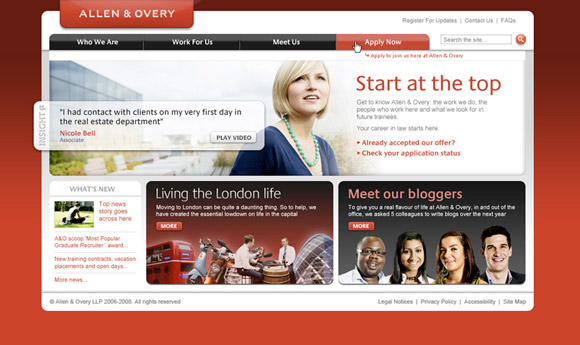
Brief: To create an award winning website that differentiated A&O from any other law firm, and give future recruits a real sense of the firm’s values. The over-arching concept of 'Start at the Top' also needed to be integrated into the approach.
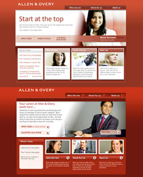
Overview: The main design challenge was to differentiate A&O in the Law graduate recruitment arena whilst also keeping the designs fresh and dynamic – and of course, still in keeping with the overarching A&O brand. The imagery, navigational interface iconography and general graphic layout was given a contemporary feel and use was made of gradients, shadows and highlights to give the final layouts, depth, interest and overall clarity. At entry points, the design, imagery and layouts are very prominent, whilst at detail level the designs are more background and the emphasis is on information and readability. Rich media content was an essential feature of all iterations of the A&O graduate Website - features such as Video Blogs and Flash games were embedded into the very fabric of the site from the outset. In addition a 'Day in the Life' guide was developed as a video narrative feature to orientate prospective graduates to life in a top-flight "Magic Circle" law firm in the metropolis.
Results & Awards:
Webby Honoree 2007, Nominee for Best UK Recruitment Website, 2007 & 2008 Target HR Awards


