 image
image
image
image
image
image
Hoare Capital Markets
Identity & Website Design
2009
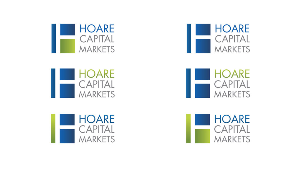
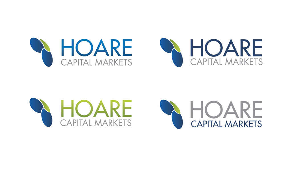
The Brief : Develop a brand indentity and logotype for a high profile capital markets investment brokerage firm.
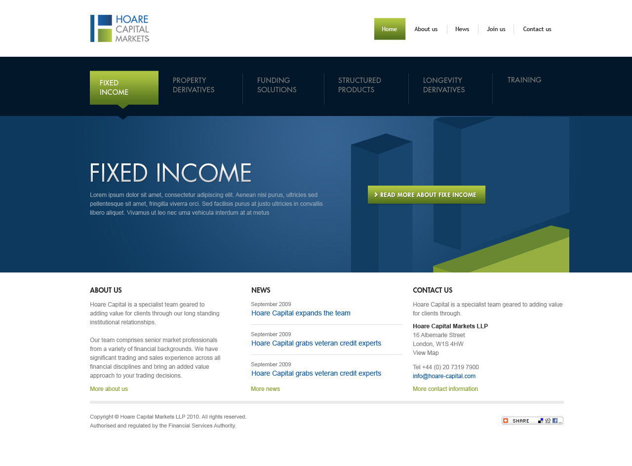
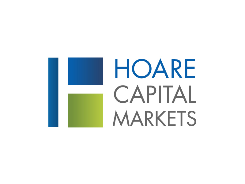
Overview : HCM wanted to update their brand presence to a more contemporary look and feel and move away from the ultra-conservative and stodgy 'broker' image that had been established. This was to coincide with the company breaking into faster moving and more dynamic markets. Branding work included a new ident as well as new colour schemes and design templates. Paramount in the idea behind the updated contemporary logo was the idea of three parties coming together - which is at the heart of any capital markets brokerage deal. This was neatly worked into the idea of the 'H' shape and bright vibrant, modern blues and greens were used with good use of white and negative space.
Results : The logotype was signed off by the board in early March 2010, and a website developed using the new logotype colourways and ident, going live in early May 2010.